What is poché?
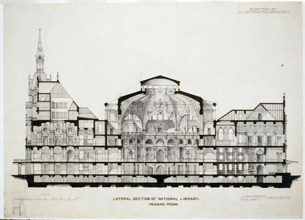
Poché is a style of presentation that involves filling the cut components of a plan or section with solid black (or closely spaced diagonal lines) to add depth and dimension to the drawings.
This technique became popular during the Middle Ages when buildings were built with thick stone masonry walls, and the walls took up considerably more space in a structure. Architects used black coloring on floorplans to distinguish thicker-walled elements from other areas. This helped them build a greater understanding of the overall dimensions of the space they were working with.
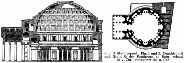
During the Gothic and Baroque eras, architects shaped rooms by making the walls thicker to create circular spaces and rounded corners. These walls often featured niches. The poche’d plan helps the viewer focus on the interior space, not the construction within the walls.
In modern architecture, poché’d areas on architectural plans often refer to the portions of the building that are non-livable spaces, such as shafts, ductwork, walls, and columns, and differentiate those spaces from livable spaces.
What is a hatch?
A hatch is a pattern used in architectural drawings to indicate the material of a surface or a structural component. Hatching is used in drawings to communicate information about a building’s construction and materials to everyone involved in the design and construction process. Hatching helps in reducing the risk of errors and ensures that the building is constructed according to the original design intent by adding readability to a drawing.
There are standard hatches for any building material that is followed worldwide. This helps to simplify the process of representing building materials and eliminates the need for a key on every drawing.
What types of drawings use hatches?
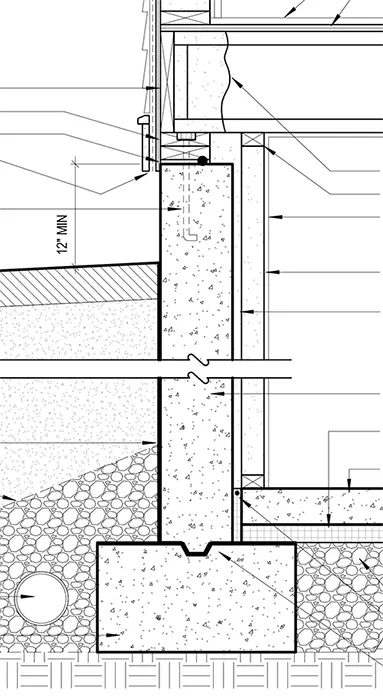
Hatches are used in floor and site plans, interior and exterior elevations, and sections. Hatches are used to indicate the type of wall, column, flooring, layers of the earth under a building, or a finish on a surface. For example, a brick wall may be indicated with diagonal hatch lines at 45⸰ angle in section. In elevation, the brick would be drawn to show the size and coursing of the brick. On the other hand, a concrete wall may be indicated with small triangles and dots in section but is usually not hatched in elevation.
Instances where hatches are used frequently:
- In elevations to indicate the type of material on the surface.
- To indicate the materials of roofing and flooring.
- In combination with other symbols and notations to indicate additional information about a surface or element.
What should you illustrate as a solid color vs hatches?
Solid colors can be used in drawings in the concept stage to illustrate the structure and add some depth to the drawings. This is especially helpful to clients or other people who may not be able to read construction plans easily.
A patterned hatch can be used in advanced stages of the design process where the materials have been fixed or are under consideration.
Solid hatches are usually used in the concept stage and patterned hatch is used in construction documents as they need exact materials to reduce any errors.
Poché vs Hatch: Final thoughts
Poché is used to define the cut elements of a drawing by filling them with black or solid dark color. A hatch indicates the material of a surface or an element that is cut in section. Hatches allow for a more truthful representation of the different materials and surfaces, adding an extra layer of information to the overall design.

